Beta wallet 4.1 release 2.0.6???
yes that’s what mine is
UPDATE ON APRIL 7, 2022
Hi guys. We’re happy to provide a new beta version to f(x)Wallet. Let’s try out our Beta 5.0! Feel free to share your experience and feedback, or report bugs( if any)to us ![]()
Download page(iOS & Android available): Get f(x)Wallet
What's new in this update:
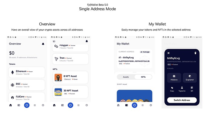
This beta version introduces f(x)Wallet Single Address Mode, which is designed to deliver a clearer and simpler experience for those who have just a couple of addresses and focus on some specific types of assets.
Say goodbye to the selection menu and Indexed List, and meet two new sections:
-
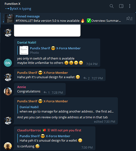
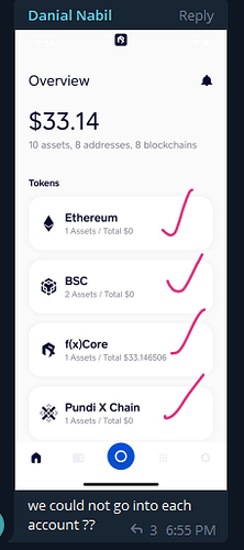
Overview: Here you could view a summary of all your token and NFT assets across multiple chains in one place.
-
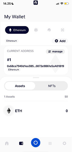
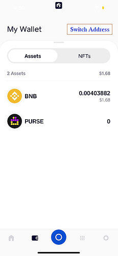
My Wallet: Pin your most-used address here and easily manage all your tokens and NFTs in the address. No longer need to select from a long list and worry about making mistakes. If you want to manage assets in another address, switch the pinned address.
not liking it so far, can’t see how to see the wallets where you where able to add address for each network and see the individual wallets total quantity, still No add assets ability’s, are you suppose to be able to access each network from the home assets tabs i can’t, I’ll try a reboot see if me result is different if so i will extend here, no change don’t like it I feels like i have lost so many functions to the current working version which i really like how it’s asset management works already, I understand the nft additions & crypto bank section revamp but hate every thing else, dose not show the the wallet name I give my wallet either. I really like the working version wallet display with the cmc value and the lower panel with the wallets and add wallet section showing the full wallet quantity, I’m mentally disturbed you have gone away from this display; i found where to add wallets but the wallet section is only allowing 1 network to be shown at anyone time there.
I change the BSC network to testnet and it showed as testnet with the red dot in the home menu; but when i switched the BSC back to mainnet the home page still shows testnet with the red dot but shows my assets, i had to go change the wallet in the wallets section and see my mainnet assets & they are showing as they should be. but the home menu is still the same i’ll try a reboot; ok reboot fixed this issue
Thank you for the hard work!
Pros:
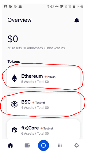
I like that it looks cleaner now and you can view the NFT category at the bottom of the page for each chain. It looks very neat.
Cons:
I don’t really like the My Wallet Tab management process. Too many clicks needed.
Suggestions:
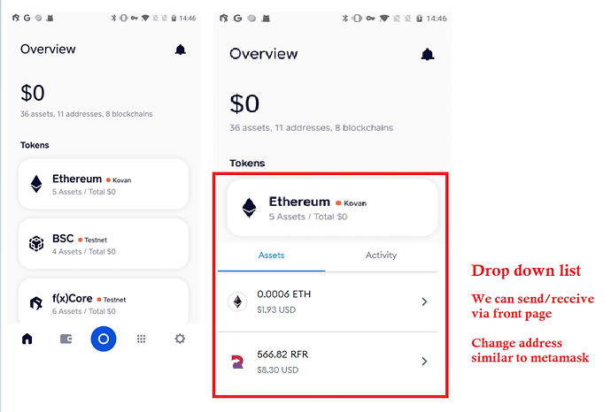
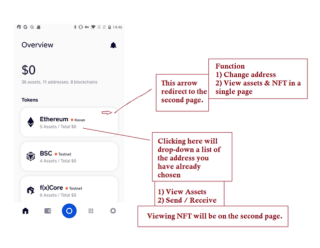
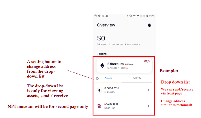
A drop down list for the assets on each blockchain in the front page. By default, it would look as per normal. But when we click the box, it will have a drop-down list of our assets.
Example:
We can click on “Ethereum” and it will drop down a list of assets that we own. So that we can directly drop down, click on an asset and send/receive via the front page.
And if we click on the box one more time, it will close back and look like the original. So basically, it is a box where we can open/close to view our assets.
I would prefer if we can send/receive via my suggestion at the top.
A box that opens/closes at the front page.
Open:
- View our assets
- Send/Receive our assets
- Close and go to another chain seamlessly
Close:
- Back to being neat and categorized
This will ease user experience (UX) by not having to do multiple clicks by going to the second page, click manage, scroll the chains left/right, sort out addresses and redo it again if we want to choose a different chain. Once again, too many clicks needed.
To solve the solution for multiple addresses in 1 chain, maybe there can be an “Add Address” button when we drop down the list.
Able to close/open to maintain the slick neat look.
The beta app looks a bit lacking in color, it would be nice to add some variant colors like the ones in CryptoBnk. I actually kinda prefer the original current layout.
Maybe we can keep this layout but add the boxes and ability to close/open a chain to maintain a slick look.
Hi Scene,
It is a great input and I agree with you.
-
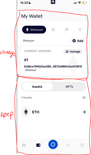
There are too many clicks required on My Wallet page, and it will be quite challenging for new users to find the "Switch Network’ button. My suggestion is to fit in the “Switch Network” page to the “My Wallet” page.
Mock up:
-
The first page has no function without dropdown list, but if we add it, it is gonna be similar with the second page without switch+add functions. Need to think to optimize the page to provide better UX.
Actually after taking a second look, the first page looks quite neat with all the chain categories.
Could do a little colors though, maybe some color gradients like the one used on Function X website.
- All that is missing is the drop-down function where we can view / change address / send & receive assets
Currently, what i’m thinking is..
If we do not use the drop down list idea - What about clicking on any box, it will auto-redirect to the second page without us having to make so many clicks?
If you click any chain box, it redirects to second page - This saves a few clicks since you already chose which network you want, it auto redirects and you are left with choosing which address.
And from there, we only need to choose which address we would like to use since we usually have more than 1 address per chain and the view our assets / nft layout can stay the same.
Second page layout is fine with me, the only issue is too many clicks. Clicking any chain on the first page and redirecting to the second page could be a solution. Hopefully someone else can give a better idea.
I tend to see most UX nowadays try to go for lesser clicks and straight to the “user’s destination”.
Destination meaning their actual thought.
- Drop-down list - Able to send/receive, view assets, change different address
- Redirect to second page - layout stays the same, only the upper part needs to change
This is my current thought - maybe can use both suggestions
I agree that if we can do everything from the first page, the second page won’t be needed.
But maybe the second page can be used to look at Assets / NFTs in a full-page style with better UX while the first page is to minimize clicks for the user.
I’m just throwing random ideas..
Hopefully someone can give a better idea. Slick UX - minimalist style with many functions is very complex.
I prefer the older version. The first page shows assets inside buttons. Kept on trying to open the assets until I realized it does not work. The design could easily confuse people who use Trust Wallet a lot like me. Also, how do you add new assets to the main page (just to track their movement)
I think most of the users that are trying out the new layout have the same vote.
The second page UX is a bit confusing. Their feedbacks are mostly on telegram.
The first instinct when we go into the app was to click the box to expand but found out later that we can’t.
Don’t get me wrong, the first page looks fine, just need some coloring. All it needs is drop-down list for each box to view assets and send/receive.
Second page could have the same function - full view single wallet where we can switch between Assets and NFT.
Just got to remove the upper manage part which is not really intuitive at first glance.
Full view single address with selection menu of addresses.
For building with intuitive reaction in mind, the word “Manage”, we don’t straight away think of changing address.
Maybe “Change Address” or something else would be better. I guess we can take examples from existing wallets.
Since UI/UX nowadays is all about “oh I know how this works” the moment the user looks at it. Or maybe just change second page to a totally new function.
Do check out Terra Station Mobile App - it looks quite neat too, can take some ideas from there
Couldn’t agree more. I would also add that “If it looks like a button, it better function as a button” so as to remove any confusion.
I am still strongly assuming the UX design team will add the landing page as a fully expandable, and reachable with all assets on a specific chain. Otherwise the design and it’s current none functional landing page will not make much sense.
Therefore my assumption, or this recommendation is to have the manage page with the scrolled chains at the top menu should remain “after” selecting the chain, from the above scenario.
So like the below pic which should imo contain all assets on that chain, and switchable at the top. By the way I was in favour of the swift changing of chain with this regards. Current token price via cmc at a glance without any additional clicks is a bonus imo and very informative.
An alternative option, is to simply have all the chains as it is now on this lastest update, but the option to leave it as the previous view (if selected or desired by the wallet user to view all assets under specific each chains.
Mananging/switching addresses has no value currently on this particular version, apart from dire confusion and frustrations which should be avoided at all cost imo and time spent on designing implementation consumptions.
I have no doubts, everyone was most comfortable with the last design, which was easier and more intuitive instantly, plus the already learnt learning curve barriers.
Please bear in mind, we’ve always highlighted the simplistic UI&UX as much as possible.
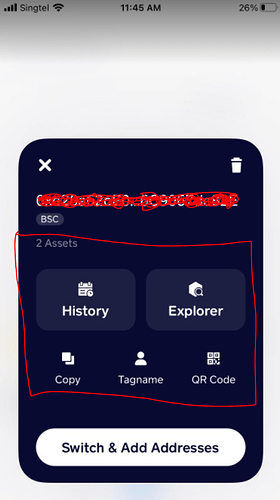
The manage button can simply or should have said switch/change address and just show the “switch address” page only, and not include the other options, history, explorer, tag name, QR code etc, so go straight from change address button to switch address landing page.
Clicking on the assets on “my wallet” page, should include all the above features, eg explore, QR code, tag name etc not just as it is as “send or receive” Only.
This “send and receive” feature is not under the manage page tab pop up, only accessible under the token asset.
Another alternative could have been to simply show all active addresses as we can see all assets. So on the “my wallet page” where it says “current addresses” show the actual numbers, like assets under that chain and therefore can change to other address if “manage” button is hit or drop down is applied.
There are multiple ways I guess we can solve this undesirable changes.
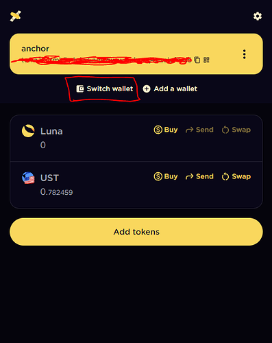
Example of Terra Station Wallet:
Front Page:
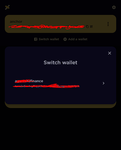
After clicking switch wallet:
After clicking “Switch wallet”, we have a full list of existing address on that chain to choose.
Keep a minimalist layout so it doesn’t clutter the user’s mind at first glance.
2 clicks needed only - Switch and choose.
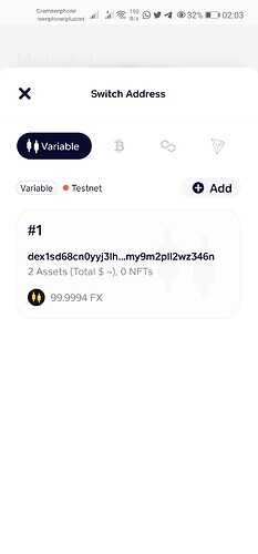
This is the current layout of Beta Wallet after clicking “Manage”.
Have to remove that whole box and replace it with a list of existing addresses. Too much clutter since the sole purpose is changing of address only - simplicity.
I’d like to say thanks to all of you. i’ve collected all feedback and suggestions to this beta version and shared with the team. your feedback helps a lot, we’ll turn them into optimizations for next version ![]()
Awesome team ![]()
![]()
IMPORTANT:
Also, it would be great to make it mandatory to have a tagged name for each address so the user know exactly which address is which from first glance.
I know we have the tagged name feature but it would be better if it is mandatory because a user may have a lot of addresses, this would make it easier on the user’s end.
Same function as Terra Wallet - every address has a code name ( it is mandatory ) - They made it this way so lesser mistakes are made on the user’s end and this gives the company more time to work on other stuff.
I am seeing lots of companies building a lot of new next-gen wallet at the Bitcoin Conference and every address is also mandatory to have a name tagged to it.
Like my 2 picture above - My codename is Anchor / Finance
Why mandatory?
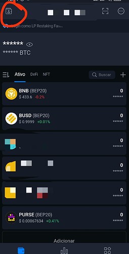
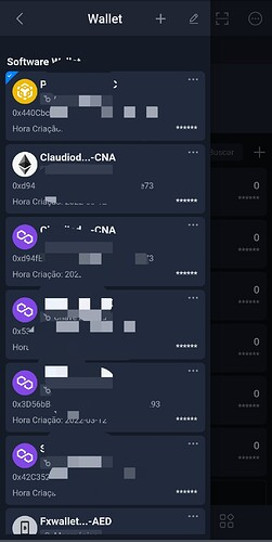
For example - Take claudio’s picture above for example - he has 7 addresses in that photo - if each address has a code name - the user doesn’t need to double check the front and end of an address to confirm its the correct one. He only has to look at the code name and click it.
So this is UI/UX at its best. It lessens the chance for the user to make mistakes. And lesser mistakes means the amount of support emails sent to the team to fix will become lesser too.
Easing both the company’s and user’s end experience.
UPDATE ON APRIL 15, 2022 [Survey & Collection]
Hi everyone.
We are now planning to provide access to more DApps in f(x)Wallet, and want to know what DApps you’d like to see in our next new version ![]()
Blockchains
Right now f(x)Wallet supports Ethereum, BSC, Polygon, f(x)Core, Pundi X Chain and Tron. DApps based on these chains would be preferred before we support more networks.
Categories
To make it well-organized, we plan to sort DApps by 8 categories in f(x)Wallet 2.0 (at least for the first release), just like other wallets. The categories are:
· Finance
· Exchange
· Social
· Collectibles
· Gaming
· Gambling
· Utility
· Other
DApps to be listed
Currently there are 25 candidates in our list, including 16 proposed by our colleagues within the team.
| Dapp Name | Blockchain | Category | |
|---|---|---|---|
| 1 | Delegate FX | Ethereum, f(x)Core | Finance |
| 2 | Delegate PUNDIX | Ethereum, Pundi X Chain | Finance |
| 3 | Deposit [aggregator] | Ethereum | Finance |
| 4 | Buy with Bank Card (powered by Ramp) | Ethereum, Bitcoin | Exchange |
| 5 | Crypto Gift | BSC, Polygon | Social |
| 6 | Mission WAGMI | BSC | Collectibles |
| 7 | Staking [concluded] | Ethereum | Finance |
| 8 | NPXS Redenomination Swap | Ethereum | Other |
| 9 | Guess Rise or Fall [Under Development] | f(x) Core | Gambling |
| 10 | Uniswap | Ethereum, Polygon | Exchange |
| 11 | Curve | Ethereum, Polygon | Exchange |
| 12 | 1lich | Ethereum, Polygon | Exchange |
| 13 | AAVE | Ethereum, Polygon | Finance |
| 14 | Compund | Ethereum | Finance |
| 15 | Maker | Ethereum | Finance |
| 16 | Yearn.finnace | Ethereum | Finance |
| 17 | Lido | Ethereum, Polygon | Finance |
| 18 | DYDX | Ethereum | Finance |
| 19 | Pancakeswap | BSC | Exchange |
| 20 | Venus | BSC | Finance |
| 21 | Alpaca finance | BSC | Finance |
| 22 | MOBOX | BSC | Gaming |
| 23 | Polygon staking | Polygon | Finance |
| 24 | SunSwap | Tron | Exchange |
| 25 | JustLend | Tron | Finance |
Besides the candidates above, what DApps you’d like to see available in f(x)Wallet?
Leave a comment or drop your favorite DApp(s) in our google sheet: DApp you want to see available in f(x)Wallet - Google Sheets
Quickswap - Polygon Exchange
Hopeforchildren - BSC Collectibles
Lottery - Bsc Gambling (for purse bsc)
Built-in dapp browser
nft market place
Hi, sorry off topic, can i ask what font do you guys use for the F(X)Wallet Beta?
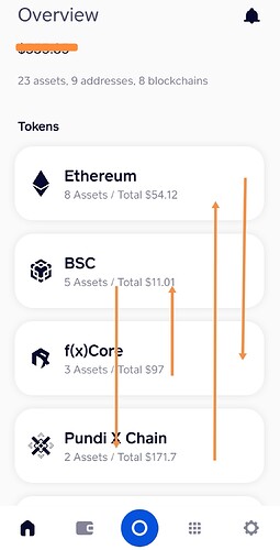
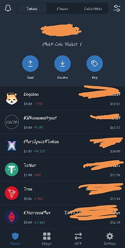
I suggest the default arrangement of the listed blockchains should be according to the amount in the users wallet. The highest amount first and the lowest last like it is done in Trust Wallet.
Like explained with the arrows in the photo above
A look at Trust Wallet below:
Agree with you. And, or maybe allow a reshuffle feature…
