Hello Pundians!
I am writing this today with purpose on helping showcase newer investors some of the basic analysis of crypto market patterns and how profit taking and market forces affect the prices of coins.
I will start my example off by showing a chart that I expect many have not seen of PundiX.
This chart shows a converted NPXS to PundiX value in KRW.
Upbit was the largest volume supplier to NPXS in the beginning of the year and we saw the largest gains coming from the korean market before the final blow off top just before the token redenomination swap.
It is easy to see that the largest “whales” in the NPXS ecosystem, the Koreans, are still seeing a healthy gain even with the painful last few weeks. Many have decided to take profits along the way down with I assume the goal of reacquiring more for the next leg up to a new All time high.
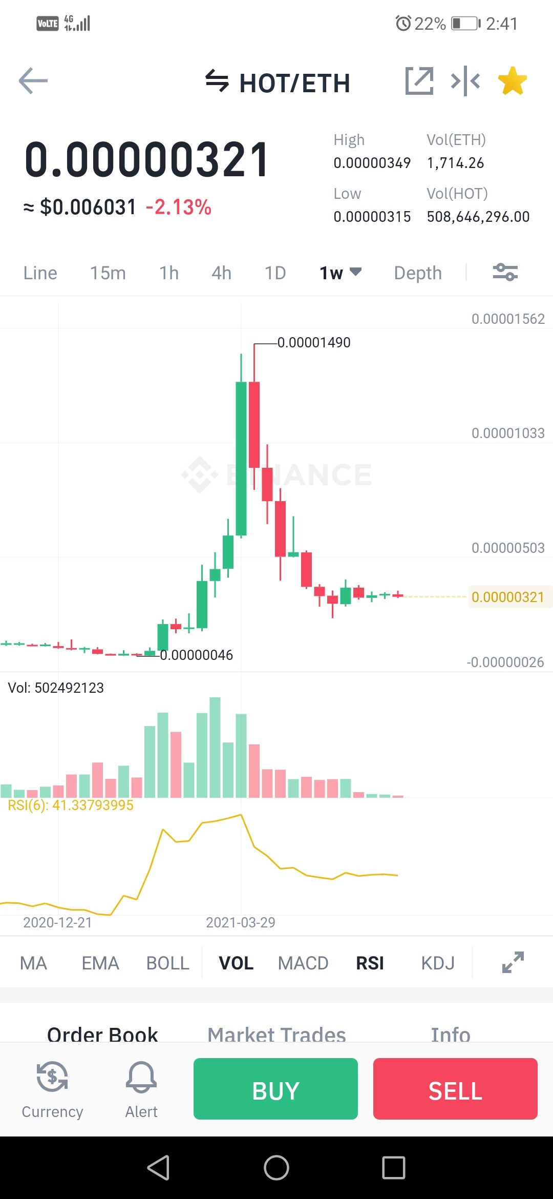
For the next step of my discussion I would like to introduce another Similar market performance chart in Bit Torrent Token.
What do we see here? A huge blow off top and a marked curving shape with the recent slash downward due to BTC dipping being the local bottom.
Now my question for the new investors is.
What are some potential market formation patterns that can happen with this type of movement?
I would encourage those that are willing to go research a few different concepts
- An Ascending Scallop Formation
- A “Blow off Top”
- A Reaccumulating phase
- A Cup and handle pattern
I look forward to future discussions to help newer crypto investors understand the phases of our highly volatile market so that they might learn how to best take advantage of the future.
Cheers!