Hi Scene,
It is a great input and I agree with you.
-
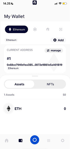
There are too many clicks required on My Wallet page, and it will be quite challenging for new users to find the "Switch Network’ button. My suggestion is to fit in the “Switch Network” page to the “My Wallet” page.
Mock up:
-
The first page has no function without dropdown list, but if we add it, it is gonna be similar with the second page without switch+add functions. Need to think to optimize the page to provide better UX.
